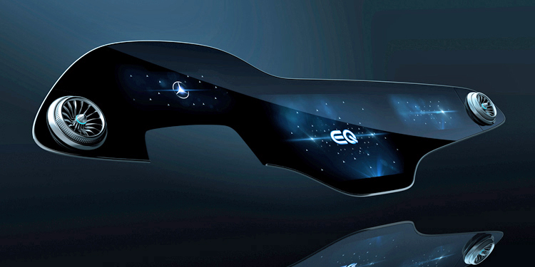
Digital Displays are all the rage these days in the automotive world, and they just seem to get bigger and bigger. What was once a 5” mail slot has grown to epic proportions; witness the 8.4” display in some FCA products, the 10” display in the new Ford Explorer, the 14.5” – fourteen-point-five! – item in the Genesis GV80 and the it-looks-like-I-got-it-at-Best-Buy-but-I-swear-I-didn’t 17” behemoth in the Tesla Model X.
It makes sense, when you think about it; you can fit more commands onto a digital display than a traditional button bank, they’re cheaper to produce and they eliminate the need for buttons that inevitably get sticky with runoff from two-cream, two-sugar caffeinated beverages.
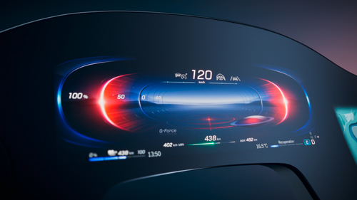
Mercedes has taken all of this to heart and created an all-new Mercedes-Benz User Experience (MBUX) infotainment interface that puts the items in all those other cars – yes, even the item in Elon’s biggest or the OLED display in the new Cadillac Escalade – to absolute shame. It’s called the “MBUX Hyperscreen” and you can forget about a traditional dash because in the upcoming EQS electric vehicle, the Hyperscreen is all the dash you’re going to get as it stretches from a-pillar to shining a-pillar.
It should be noted that while it looks like a single display, it’s actually three strung together to form a curved viewing space measuring 55.5” and with a total area of 2,432.11 cm2, making it the “largest free-form glass structure there’s ever been in a Mercedes”, according to the manufacturer. That’s probably a pretty small sample size but either way; that’s a lot of silicon and it requires – wait for it – an 8-core CPU and 24 gigs or RAM with a 46.5 gig-per-second bandwidth to operate.
It should come as little surprise that the Hyperscreen gets special coatings to reduce smudging and reflections, offers haptic feedback to button presses and can change to adapt to ambient lighting levels in milliseconds. What’s most interesting though is while this all sounds incredibly complex, it’s actually been designed to be as simple as possible. We’ll let Vera Schmidt, head of Mercedes Advanced Digital Design, explain what we’re on about.
“(MBUX) is a milestone in the merging of analogue and digital design,” she says. “We call it ‘zero-layer’, (meaning) all the necessary information is always arranged in front of the driver.” That’s important, because the dangers of driver distraction as they try to search for a command on a huge screen have been argued by my colleagues for a decade. So not only does this make it easier to use, but it makes it safer, too, since you don’t have to scroll through any menus to get to the commands you want. It sounds good, but there’s a lot of data being displayed there and it will be interesting to see how all that works in practice.
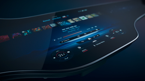
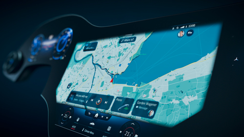
All that processing power isn’t just for the fancy graphics, however; in fact, much of it is used to power the artificial intelligence – Mercedes’ choice of term, not ours – aspects of the system. Basically, MBUX gen 2 remembers if you call a certain friend at a certain time of day – say, during the drive home from work – and will prompt you to call them around that time with a simple graphic. If you like a hot stone massage – yes, the EQS can simulate this, likely by combining its seat massage and heating system – when the temp drops below a certain level, the system will again prompt you to activate it once the conditions are right. If you use certain features quite often, the system will automatically place those icons at your fingertips, below the navigation map – that always stays in its spot at the centre of the dash. It’s all attached to your user profile so if someone else is driving your car, they won’t be asked if they want to call your friend.
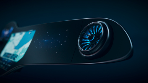
So if the leftmost display (in left-hand drive cars) shows the gauge cluster, the central display shows the navigation and your “favourites”, then what’s the function of the rightmost display? Well, it’s actually manifold as it allows front seat passengers their own screen to watch Netflix (in some markets, anyway), activate climate control or browse the web, and they can share any info there with any other passenger in the car as they all get their own screens. Or, the passenger can help the driver by setting navigation routes and so on.
“We created the specific screen with the perfect ratio of size and functionality to provide the greatest benefit to the user,” said Sajjad Khan, Mercedes-Benz AG board member. “It had never been about creating something bigger. Instead, creating something innovative, valuable and intelligent for our customers.”
All we know is that if the display system looks this wild, imagine what the rest of the car is going to look like. More on that soon; watch this space.


